Taking too long? Close loading screen.


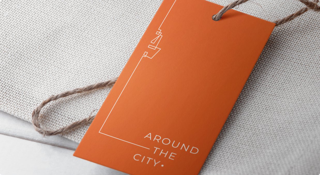


Reflect your brand values in your visual identity
Building the right brand identity for a homegrown, conscious apparel business that clicks with Around the City’s ideal customer base from the get-go.
30 Days
The inception of a minimalistic yet artistic expression of every aspect of the brand’s visual identity.
Helping the brand stand out in an already crowded marketplace of sustainable fashion.
Brainstorming a visual experience that’s reflective of the company’s ethos as well as demands consumers’ eyes in the market.
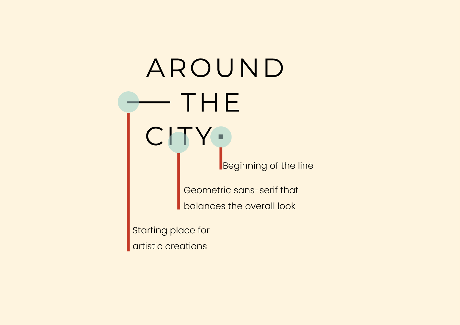
We took inspiration from geometry to create symmetrical visuals that complemented the brand’s minimalist aspirations.
A dot marks the beginning of a line, which denotes that this brand is where you start your sustainable fashion journey. A line is a starting place for most artistic creations, signifying that Around the City is a starting place for all the artistic experiments.


Already gushing at the thought of having a successful brand?
Rajkunwar Pawar ©2022