Taking too long? Close loading screen.

Vibini

Showcase your brand values through your creatives

Task

Developing a clear and consistent brand guideline to be used for all the future creatives

Key Deliverables

  • A unique brand guide made from scratch for a newly launched homegrown brand
  • Visuals that show the customers what brand really is about and how they are contributing to their health and lives overall

Results

The creation of a vibrant and clean brand visual aid, which dictates all the marketing collateral of the brand

Common customer pain points that were identified

Giving direction to a newly established brand trying to find its place in the market.

logical approach to the visual story of Vibini.

Clarity on what the brand stands for and delivers through vivid imagery.

Clear positioning of the brand achieved using in-depth research.

The strategies used to achieve the brand’s vision

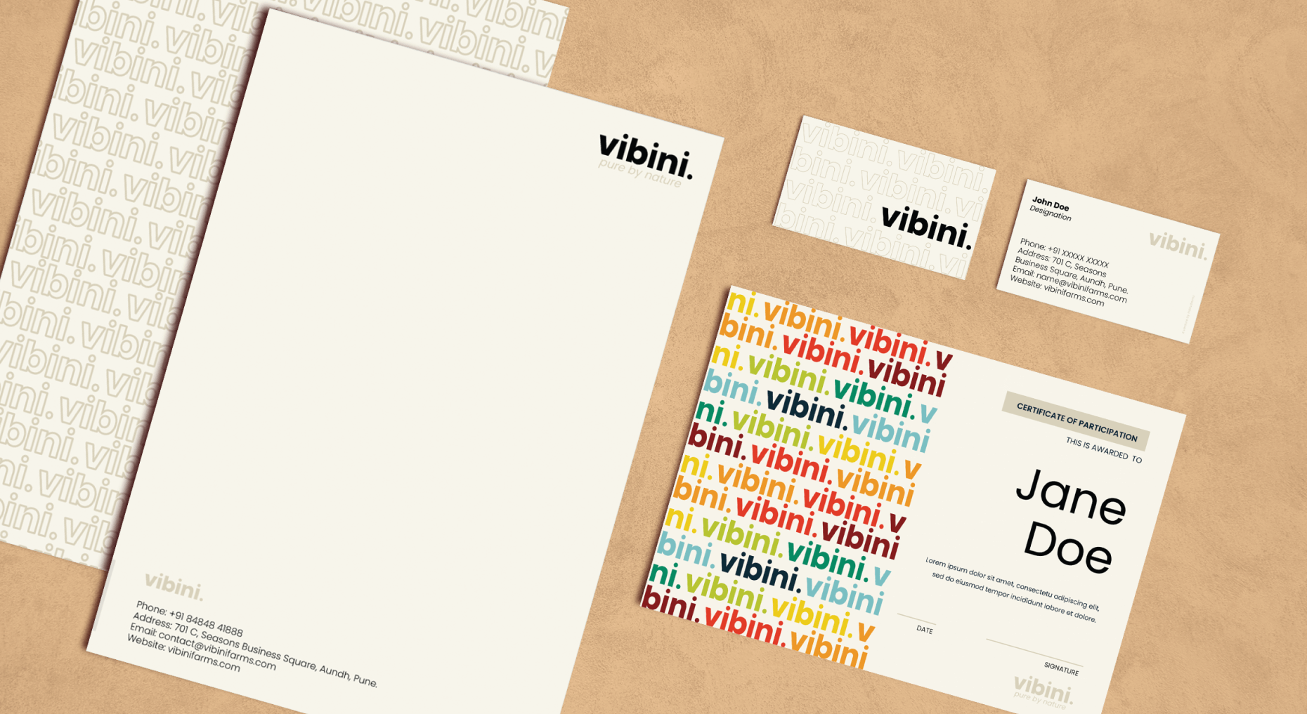
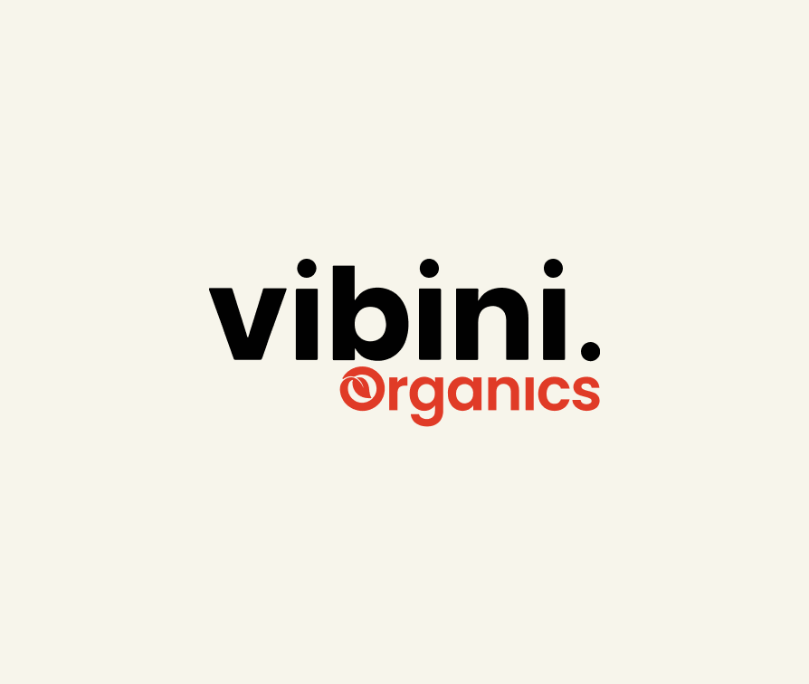
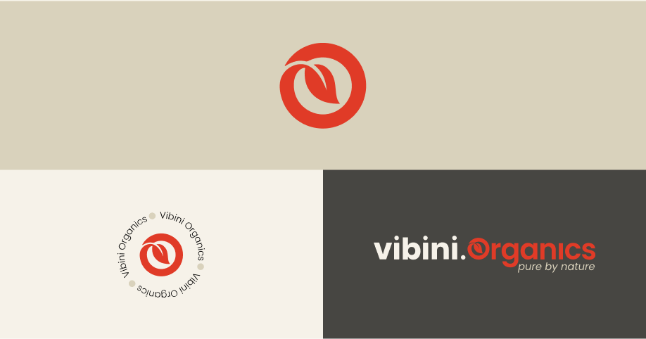
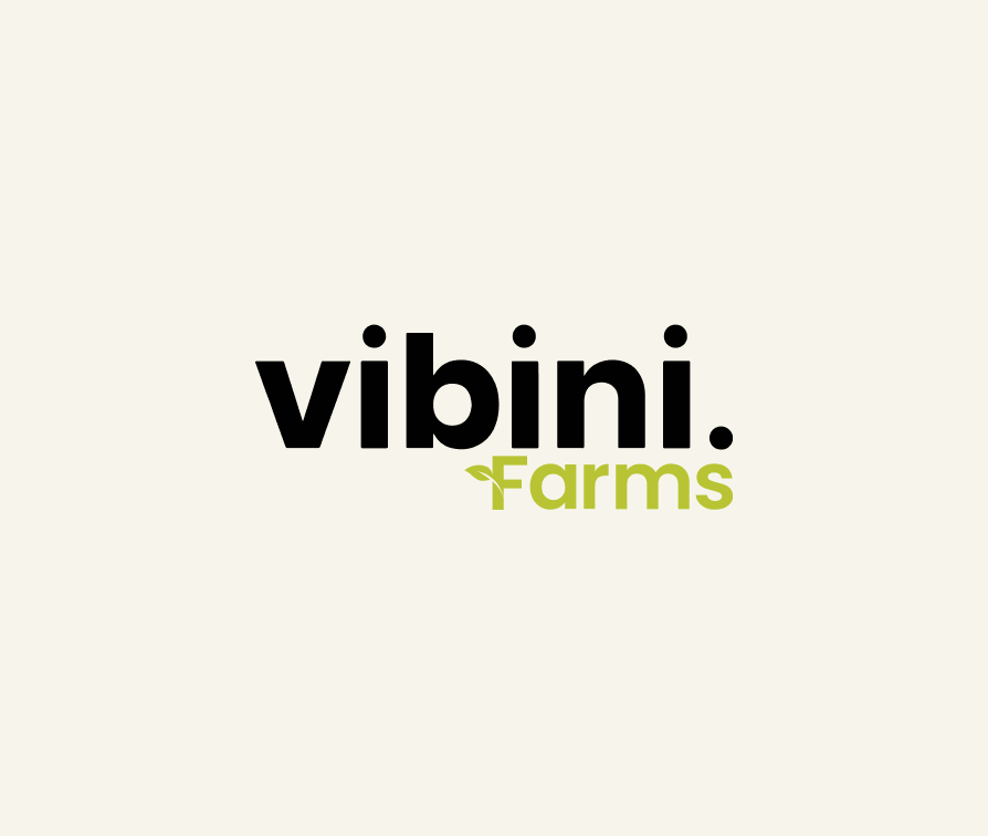
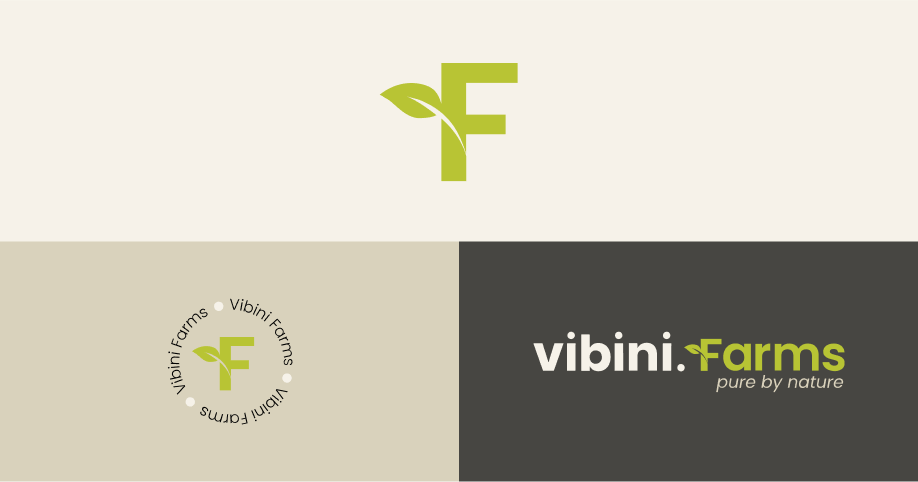
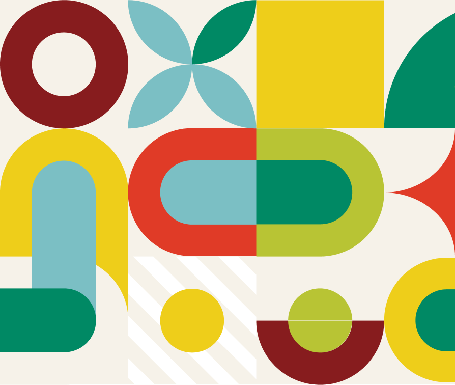
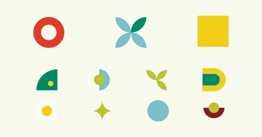
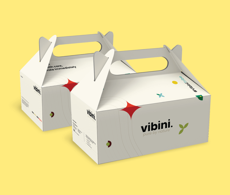
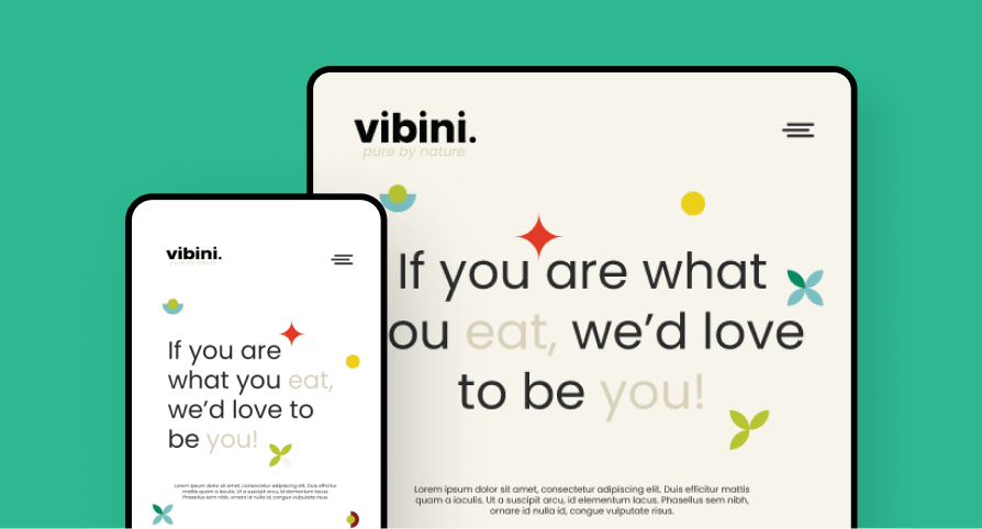
Inspired by the brand’s values - transparency and sustainability - I collaborated with Vibini to develop elements that conveyed their mission and vision for the market.

Three immensely diverse yet coherent pieces of patterns were designed to accommodate all the different marketing collateral.

All the visuals were centred around minimalism, premium quality and environmentalism.

Key elements of the overall brand experience

The logo for the consumption sector is designed to denote the word ‘consumption,’ in that, the leaf is turned inside the letter ‘O,’ showing the leaf being consumed.
And for the agricultural sector, the leaf signifies crop cultivation, which is why it is seen growing out of the letter ‘F.’
Brand positioning and market differentiation through striking imagery.
Visuals emphasising the homegrown and organic qualities of the brand.
Clean, product-focused graphics that communicate the brand’s vision even at a single glance.