Taking too long? Close loading screen.

A dynamic identity and store system for India’s first kids super store, designed to feel playful, future-ready and approachable at every touchpoint.
House of Toys needed an international yet approachable identity for children and parents. The work began with a dynamic logo system and extended into packaging, merchandise, façade, signage, environmental graphics and launch activation.
The cheerful ‘oy’ expression became a compact character inside the larger wordmark, giving the brand a playful voice at every scale.

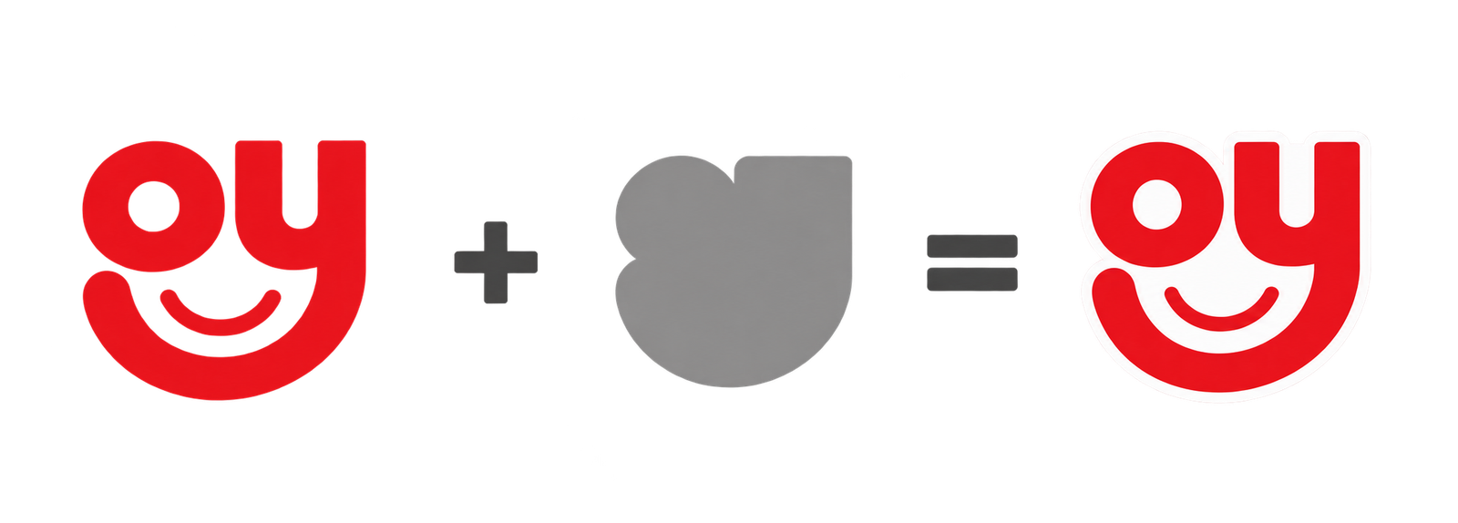
Created for India’s first kids super store, the House of Toys identity needed to feel young, modern and international. The ‘oy’ becomes a smiling character at the heart of the mark, while the bold red, blue and yellow wordmark builds instant recognition. That playful language extends into tape, tags and gift wrap, turning every package into part of the store experience.
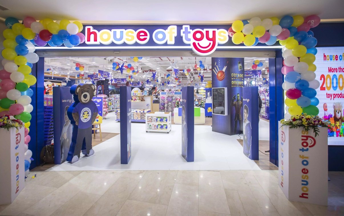
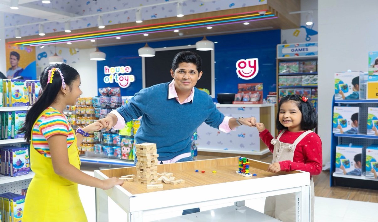
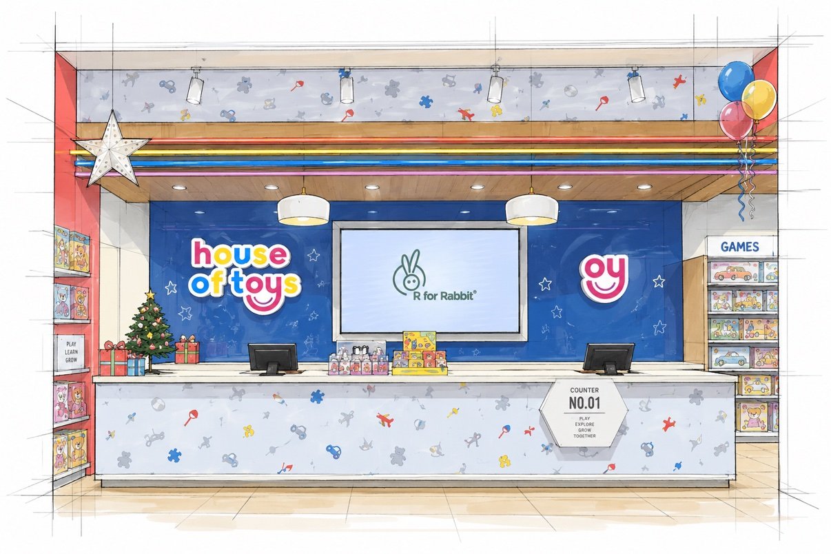
A complete retail experience connecting the brand’s playful voice to the practical structure of the store.